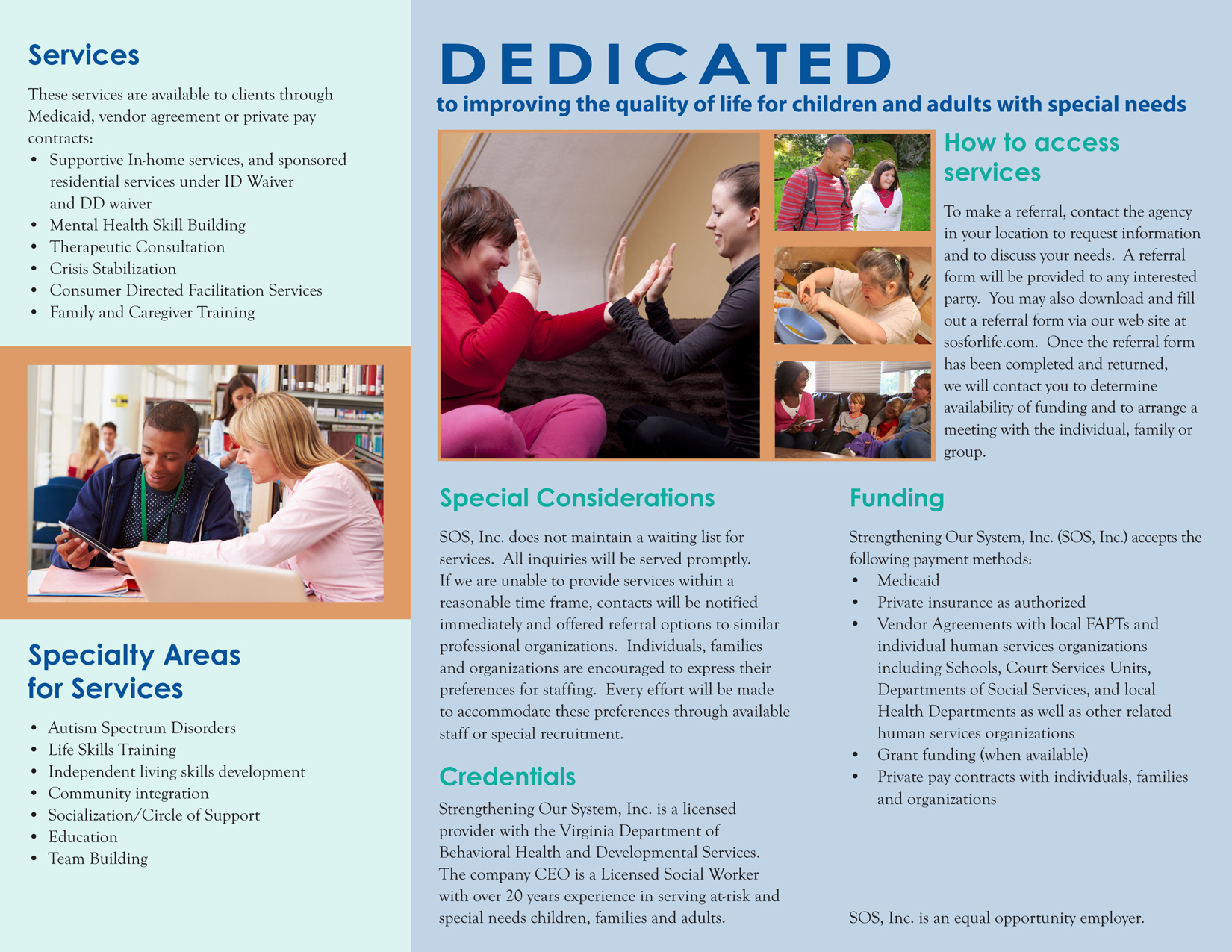
The Challenge
When the Richmond office was opened, SOS hired someone to manage it. That person was also dubbed with some marketing responsibilities. She spear-headed a change in the logo and rebranding. It was thought that the logo at the 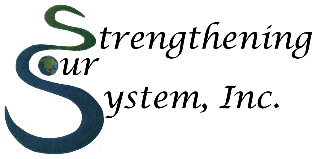 time really didn’t “show” what they did as a company. The “S’s” were intertwined like a river and the “O” was planet earth. At first glance someone might interpret they were an environmental company or a global one. However, SOS is in the business of helping those with disabilities. SOS = Help.
The challenge was then to come up with a new logo that was clean and to represent more of what they do as a business.
The Solution
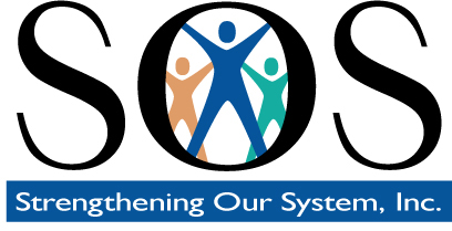
I chose to focus on the SOS instead of the entire business name. When they answered the phones, the introduction was “Thank you for calling SOS,” and being that the company name was first thought of as the acronym SOS (since they helped people), then why not make a logo to reflect the same? I started with SOS in various fonts and in the end manipulated the chosen serif font to become a sans-serif. I chose three people in the center of the “O” as there is usually a client and then one more more workers who go in the private homes to provide help. I planned to kept the original logo colors, but added an accent that could then be used in various ways in supportive marketing materials.